
.jpg)


Mobile Popup Best Practices: 9 Tips For Designing Popups That Convert
8 min read time
Published on Jul 7, 2020
 Here’s a not-so-secret tip, from the lips of a self-identifying phone addict directly to your ears: people are glued to their phones. It’s basically a vital organ. Don’t lie, you’re one of us.
If you still think mobile devices are just for social media and GPS navigation, think again. Consumers are buying on their phones and tablets. By 2021, it’s estimated that 54% of ecommerce will happen via mobile. And 55% of consumers have bought something online after discovering it on social media (remember, those Instagram ads you pay for go directly to your mobile site!).
This one will blow your mind: for Shopify merchants, mobile accounted for 69% of sales during 2019’s BFCM.
Get our best content on ecommerce marketing in your inbox 2 times a week
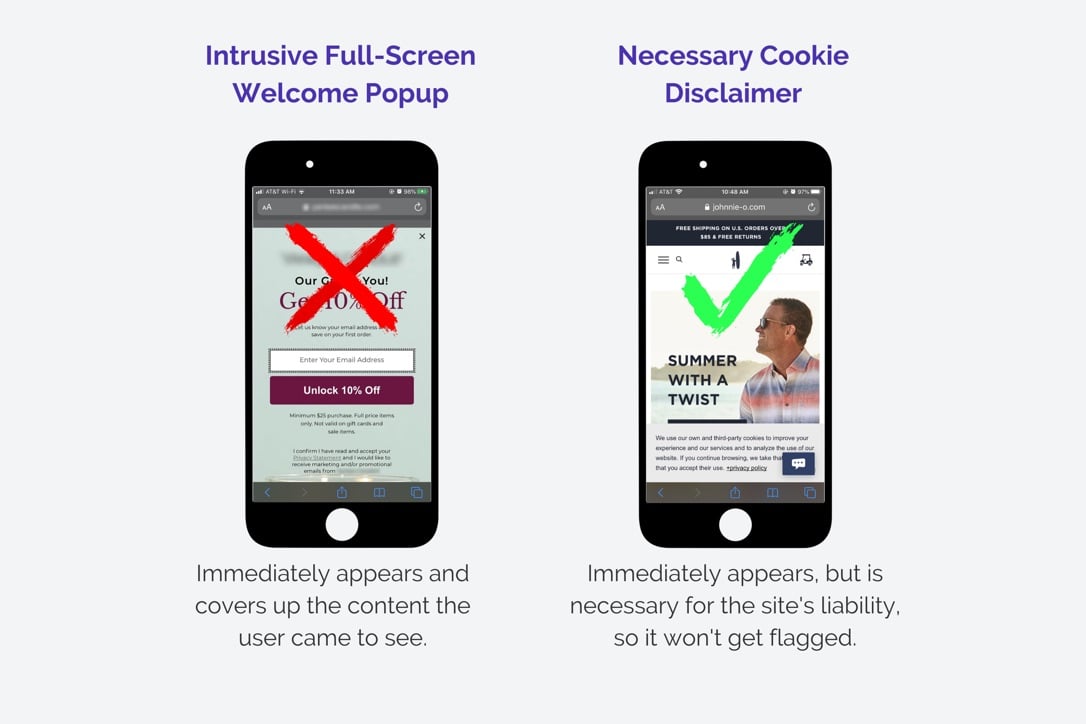
So there’s enormous opportunity for your mobile site to be your best untapped salesperson. Many ecommerce stores are leery of using mobile popups because they’re afraid of violating Google’s rules around intrusive interstitials (TLDR; Google penalizes sites with intrusive mobile popups by demoting them in the search rankings, unless the popup is a necessary part of the site, like an age verification or cookie disclaimer).
Google just wants to ensure popups don’t interfere with the user experience. Makes sense, right? Does that mean you can’t deploy popups on your mobile site though? Absolutely not. You just need to do it in a way that easily allows your visitors to view the information they want. Basically, you don’t want your popup to be “intrusive,” which means:
1. It shouldn’t take up the whole screen, thereby blocking the user from viewing the content on your site, or;
2. If it is a full-screen popup, it should appear only after the user has scrolled down or visited a few pages, to show their interest in your content.
Note: it’s fine for a pop-up to appear immediately if it is necessary for the operation of your site, such as a cookie disclaimer, age verification, or country verification:
Here are a few tips for creating highly effective mobile popups that convert visitors into customers.
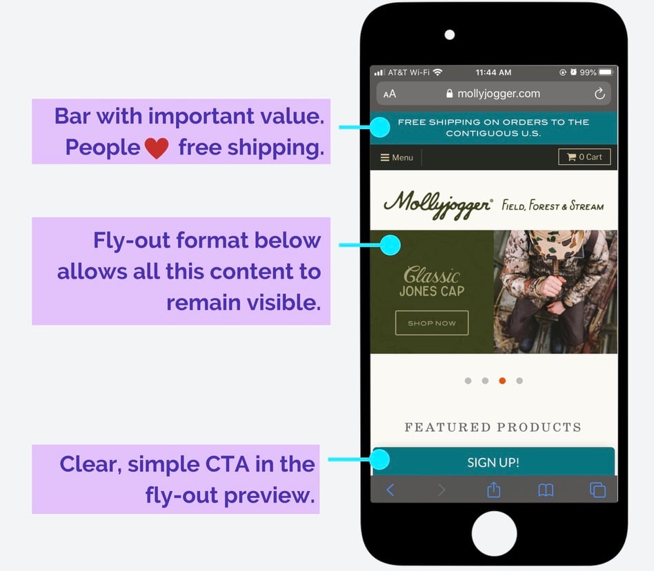
1. Choose a compliant format
If you’re worried about the Google police demoting your site because of intrusive popups, you can remedy this simply by choosing a format that takes up less real estate on the screen (aka, less intrusive options). Bars, for instance, are easy to view on mobile devices, and take up very little screen space. These are especially useful for displaying free shipping or discounts you want to feature across multiple pages, like the example below from Mollyjogger:
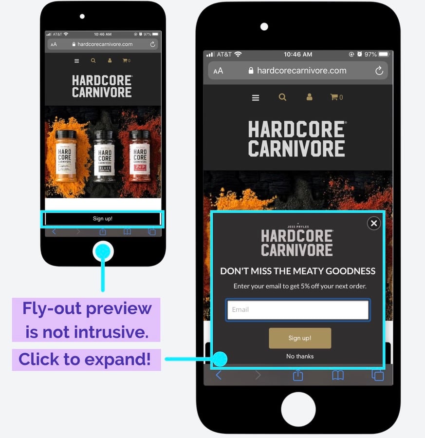
Alternatively, if you’re using a welcome popup, fly-outs are the way to go. These types of popups start with a teaser in the corner or at the bottom of the screen, and then expand when the user clicks, like this one from Hardcore Carnivore:
Whatever you choose to do, just be sure to make it mobile-friendly by scaling the dimensions to best fit a phone, rather than a computer screen. In Privy’s popup editor, you can choose from templates specifically optimized for mobile, so this should be pretty simple! It’s also easy to copy your desktop popups into a mobile template and revise from there.
2. Or go big, but be tactful
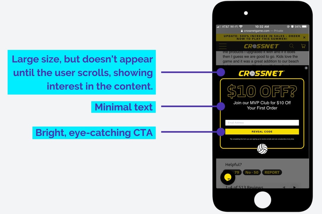
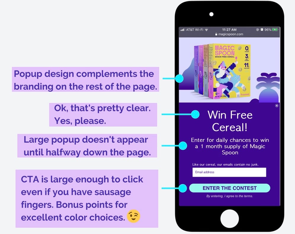
I get it. Full-screen popups look good. If you want to use them, you can remain compliant with Google’s intrusive interstitials policy by triggering larger popups only after a user has expressed continued interest in your content. This could mean a scroll-triggered popup half-way down the homepage, like this one from CROSSNET:
It could also mean a popup triggered to appear only after the customer has visited a few site pages.
And to keep these popups unobtrusive, always make it easy for a user to close out, by making the X large enough for people to easily click it on a touchscreen.
3. Segmentation is your friend
The more personalized your message is, the higher the likelihood the visitor will convert. So try tailoring the shopping experience to your different audiences, such as:
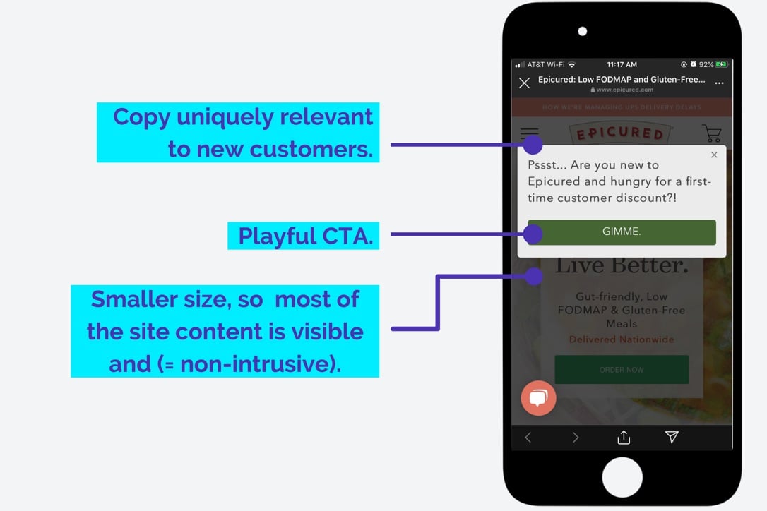
1. Brand new site visitors (like the Epicured one below)
2. Serial browsers who have never purchased
3. Shoppers who have abandoned their cart
4. Loyal customers or frequent buyers
5. Visitors referred to your site from social media
6. Located in a specific geographic area
Depending on which category the visitor falls into, you can tailor your mobile display to the one that will be most relevant.
4. Make your CTA direct and clear
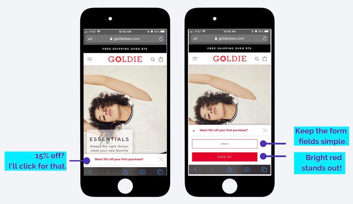
Mobile popups are small, so they need to have a clear goal, with a design that packs a punch. The CTA should be an obvious prompt for what you want your customers to do, like Goldie’s no-nonsense fly-out. If users are confused, they’ll just swipe away without converting.
Not only should the words be clear, but the CTA should stand out. Use a contrasting color like Magic Spoon’s electric cyan and make the button large enough that’s easy to click on when using a small touchscreen.
 5. Choose your words
Phones are the devices where your customers are likely to have the shortest attention spans, so keep mobile popups fairly short and sweet. It’s all about choosing your words carefully and making them count.
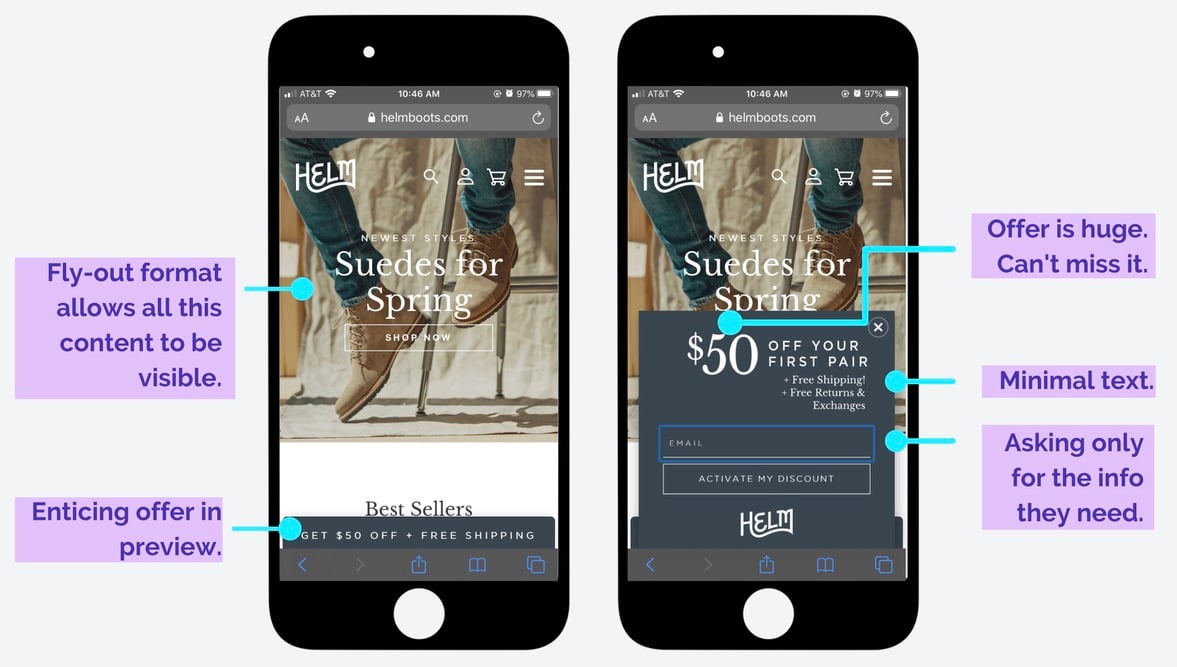
First, remember that you don’t have much physical space to work with, and your users may not have young eyes. Larger, more minimal text will have the most impact, like this one from HELM Boots:
 6. Think about your form fields
No customer wants to feel like they’re writing a longform essay when they’re signing up for your marketing emails, so don’t ask too much of them. A smartphone is oftentimes used for quick, asynchronous communications and actions, so your users may not have the patience to type in lots of information.
Think through the most critical form fields for your marketing strategy and take the time to imagine the user experience. Do you need anything besides their email right now? Does it make sense to ask for a phone number so you can send a text marketing message in a few minutes, while the customer is still engaged on their phone? What’s more user-friendly: radio buttons or dropdown menus? Ask only for what you need, and make it as easy as humanly possible for your customers to give you the information you want.
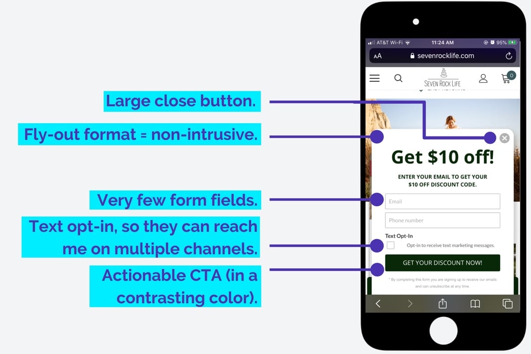
Seven Rock Life pared down their form fields by asking only for their visitors’ email and phone number, which gives them the opportunity to launch a follow-up text marketing campaign.
7. Gamify
You may be wondering a few things by now. For instance, is there something unique you can do for your mobile popups? Does Rachel spend all her free time scavenging the internet for great popup examples? The answer to both is yes (nerd alert!!).
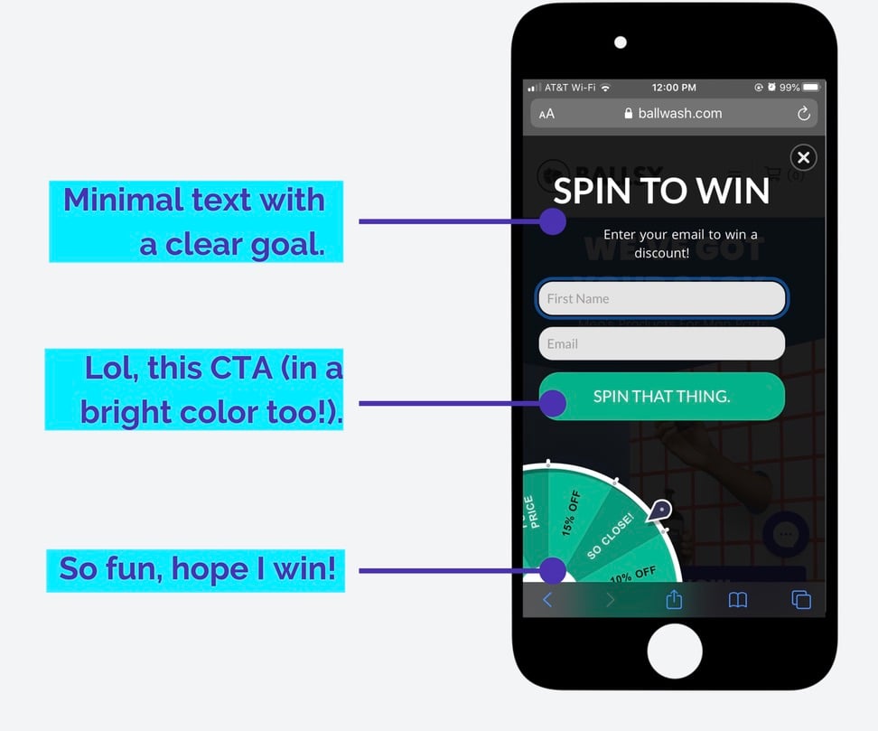
To spice up your mobile campaigns, try a spin-to-win to create an engaging user experience that mimics the gamification people already love to partake in on their phones. It may not be nearly as fun as Candy Crush, but it’ll work. This popup from Ballwash pairs perfectly with their tongue-in-cheek brand voice:
 8. Use an exit intent strategy
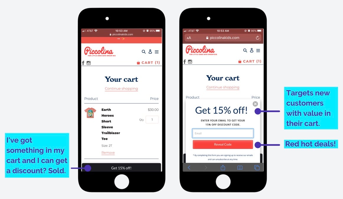
You don’t want your mobile visitors bouncing away without converting to a contact or making a purchase. Once they’re gone, it’s very hard to get them back. So, use your marketing strategy to level with them while they’re on your turf by deploying an exit-intent popup that triggers when a user is about to navigate away from your site. This is where you entice them with an offer in exchange for their email address, in hopes that it seals the deal, or at the very least you can continue to stay in touch for future revenue opportunities.
This one from Piccolina appears on the checkout page, and is triggered when a visitor has an item in their cart but is about to exit. The goal here is to save the sale with a discount to their inbox:
 9. Avoid images
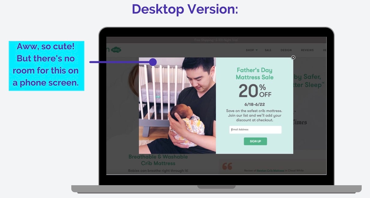
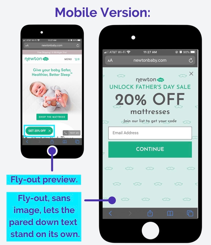
I know, I know. Normally, we’re obsessed with a popup featuring an amazing product photo. But on mobile, it just looks busy (not to mention, photos take up a lot of space, which you don’t have). Instead, opt for a simple design with high contrast, and let the product images on your website speak for themselves. Here’s how Newton Baby made small tweaks to the desktop version of their popup to make it a mobile-friendly fly-out:
Takeaway: Be where your customers are
If you don't have popups that are specifically designed for mobile, you're missing out.
Now that you've seen a bunch of examples from brands that are getting it right, you should have a really good sense of what matters most.
And if you still need more inspiration, go to some of your favorite websites from your phone and see what their mobile popups look like.
With these 9 tips, you're ready to create mobile popups that people will actually engage with. So you can market to more people. And drive more sales.